Objective
To create a satirical print publication that uses humor to shape better allies by showcasing articles that address issues of race, politics, and other cultural issues.
Client
This was an project for my Typography 3 course.
Deliverables
A wordmark, style guide, and multiple magazine layouts.
Research
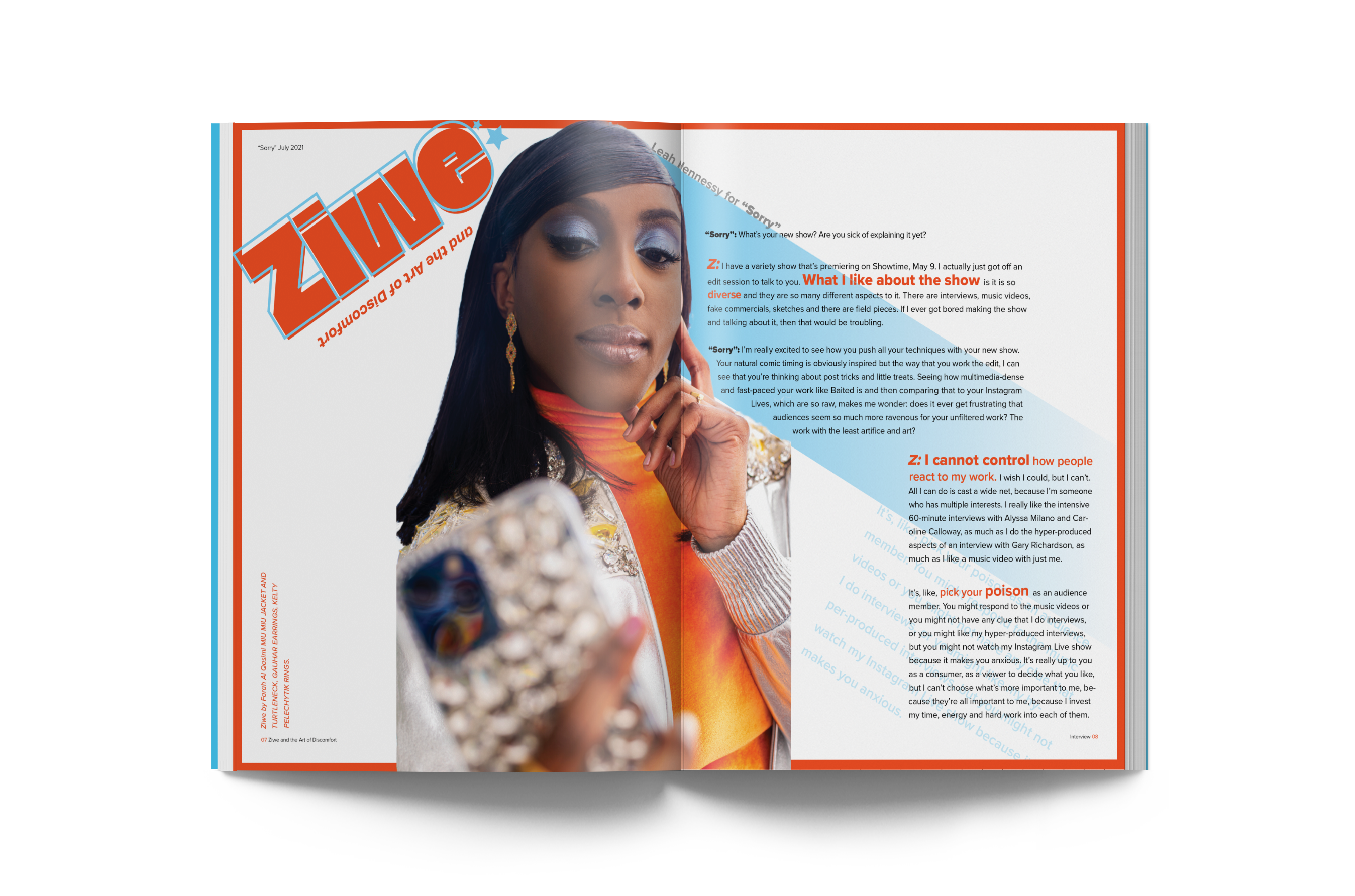
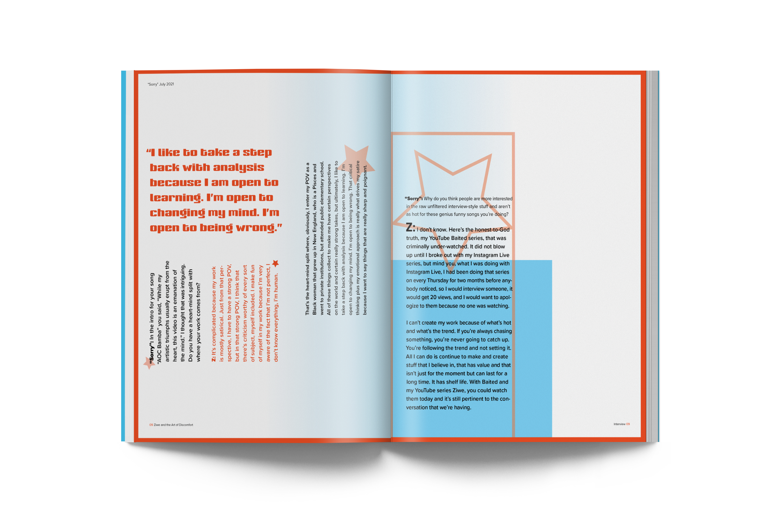
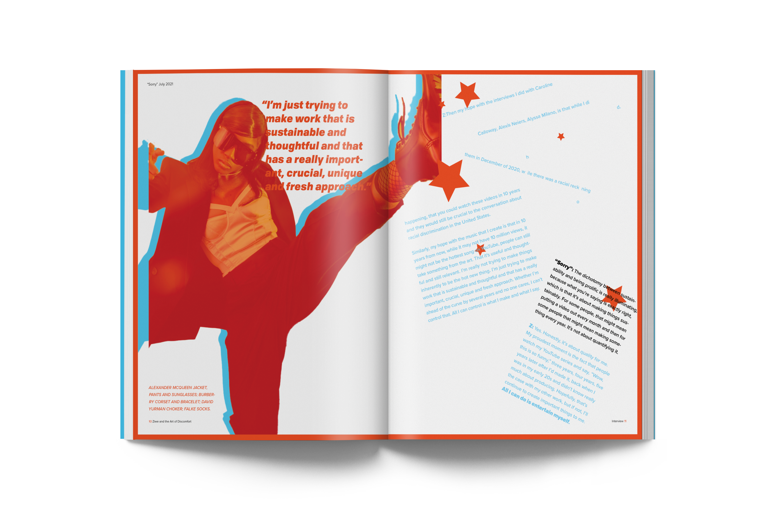
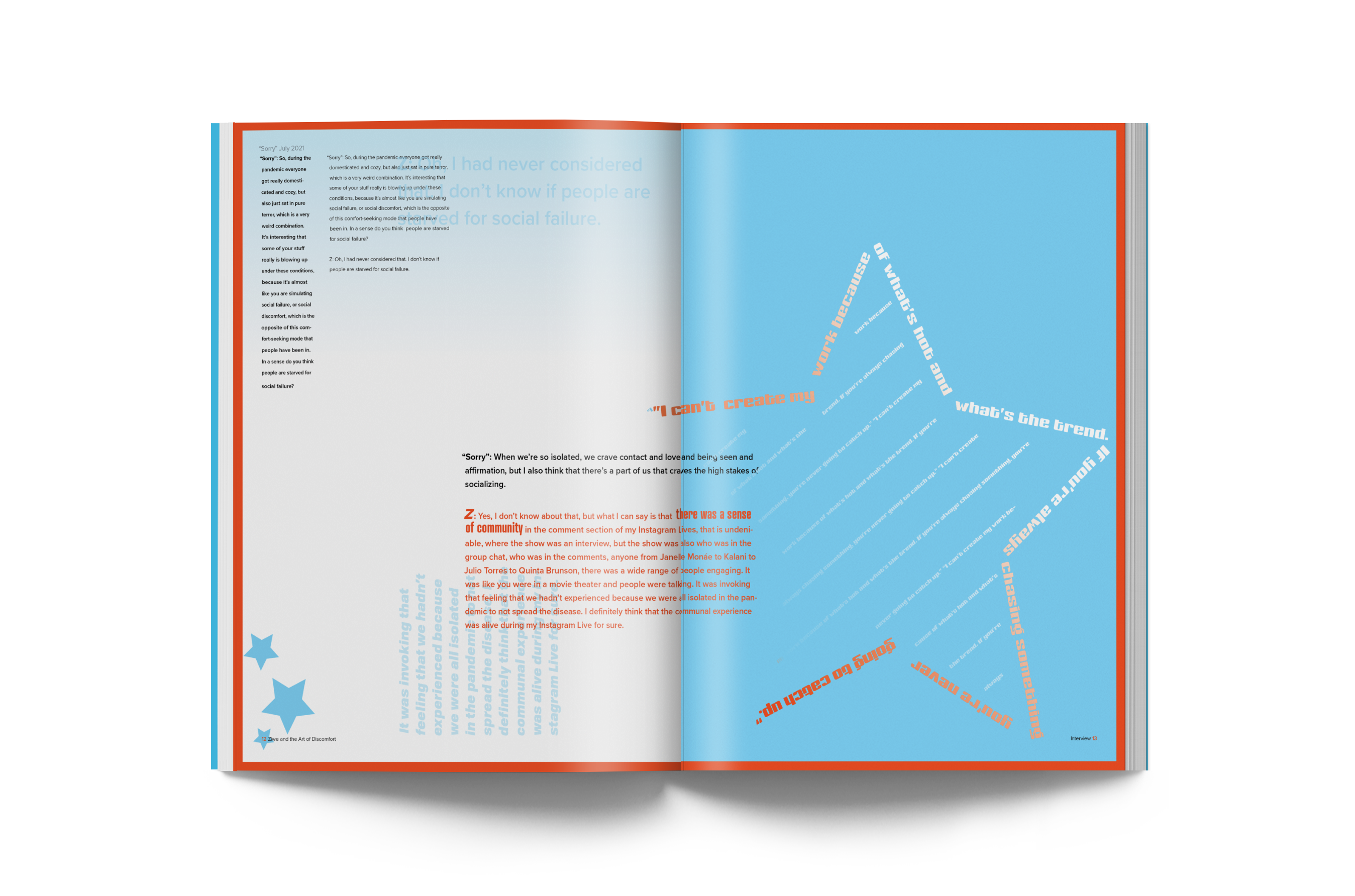
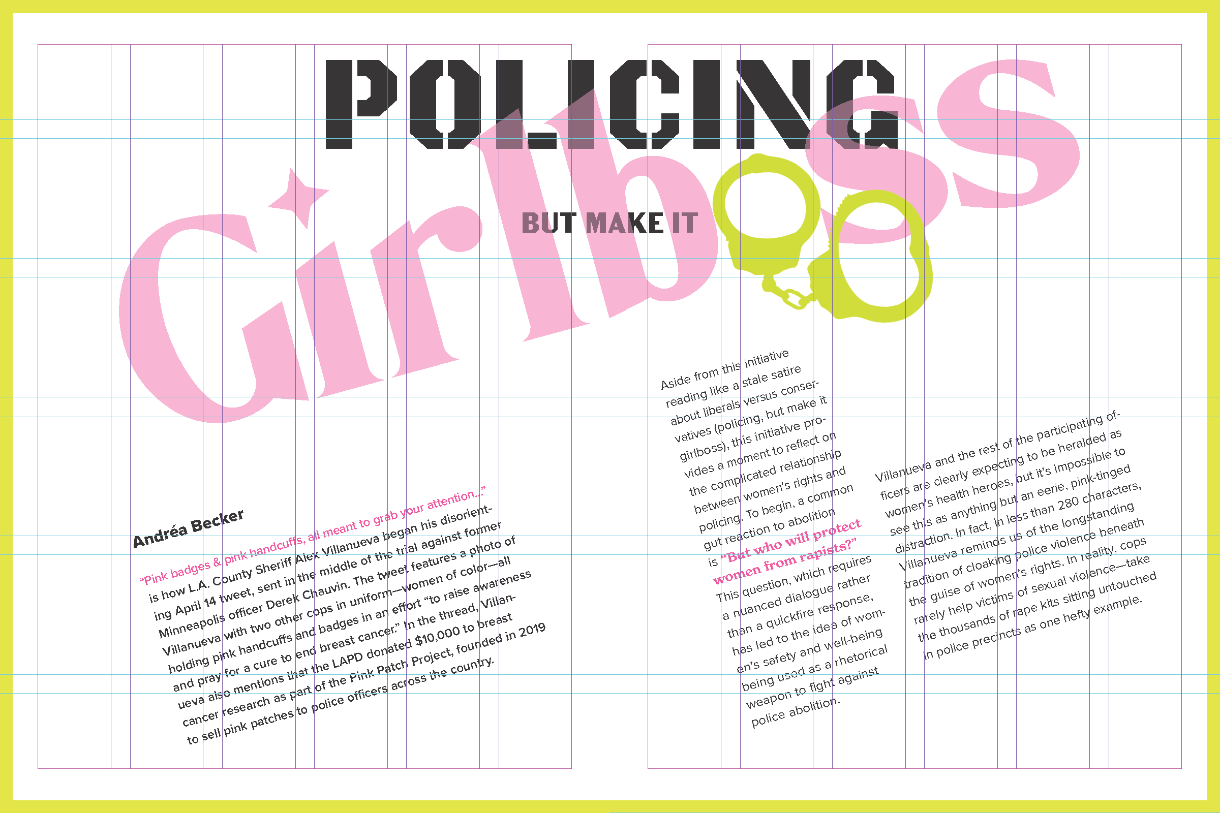
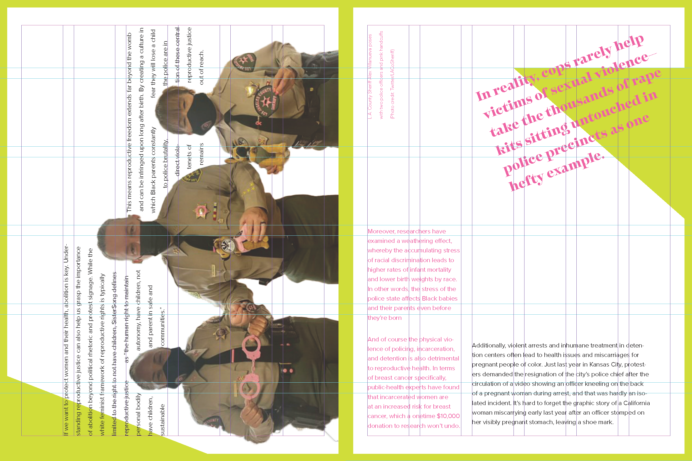
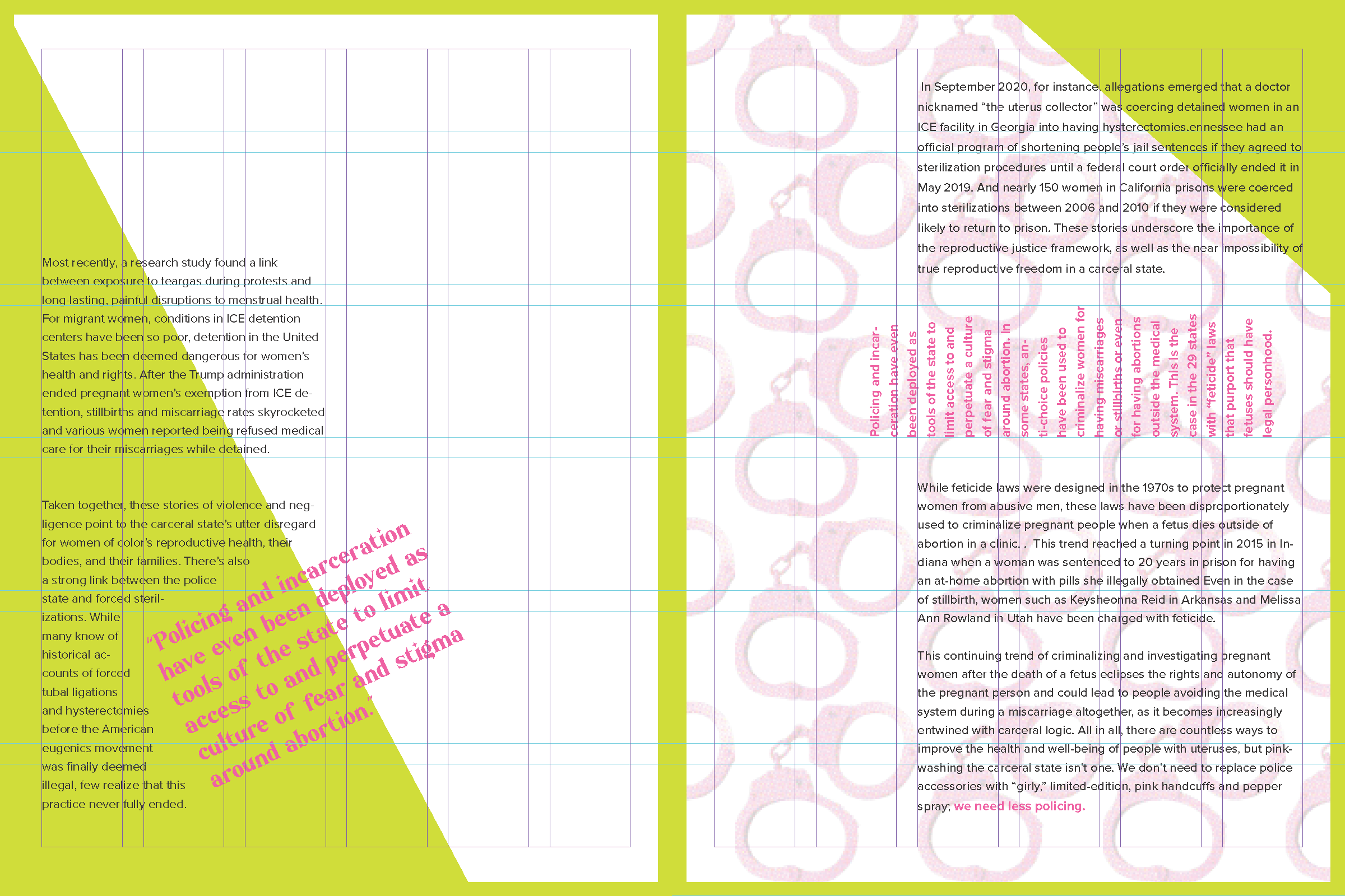
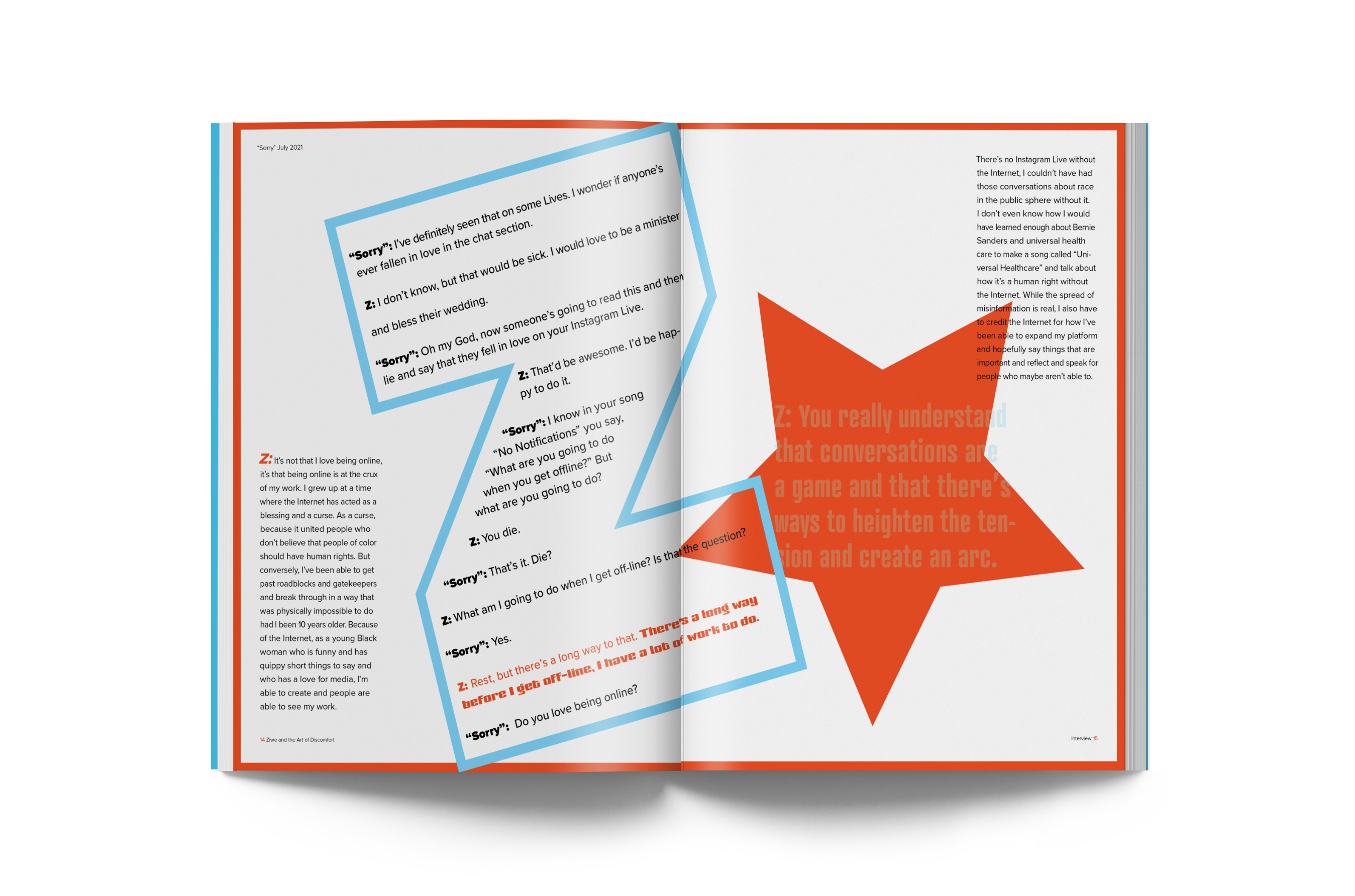
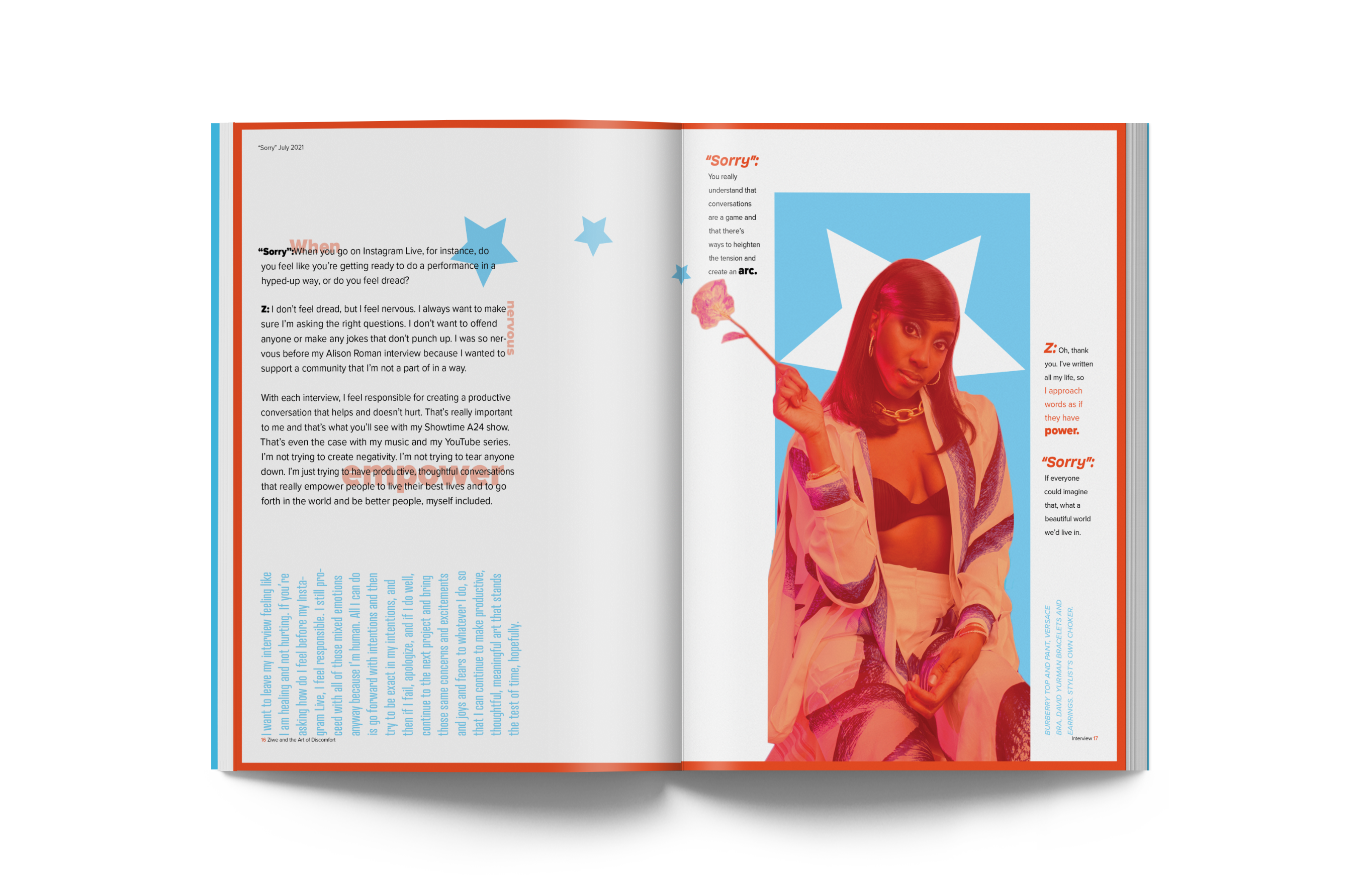
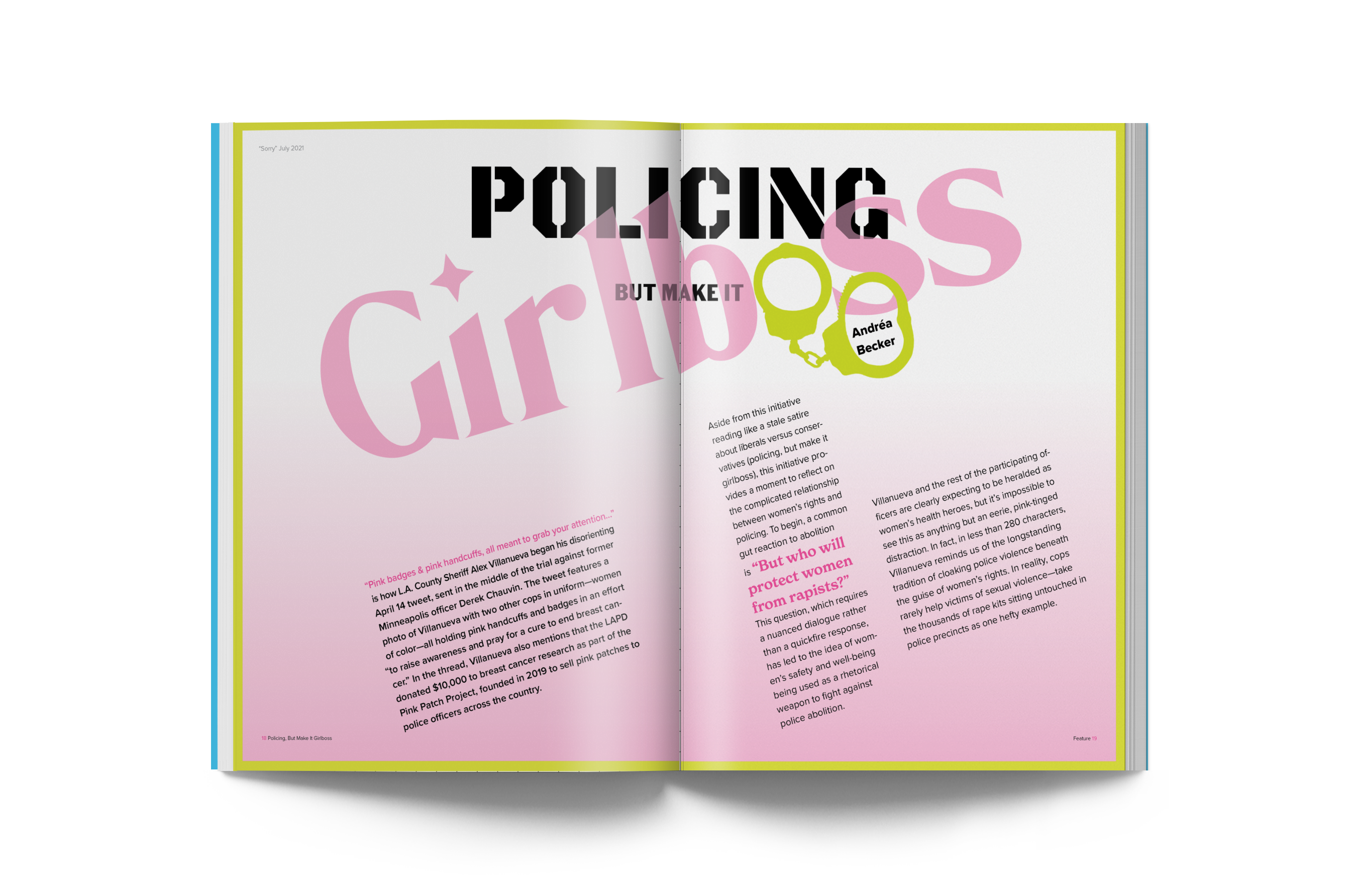
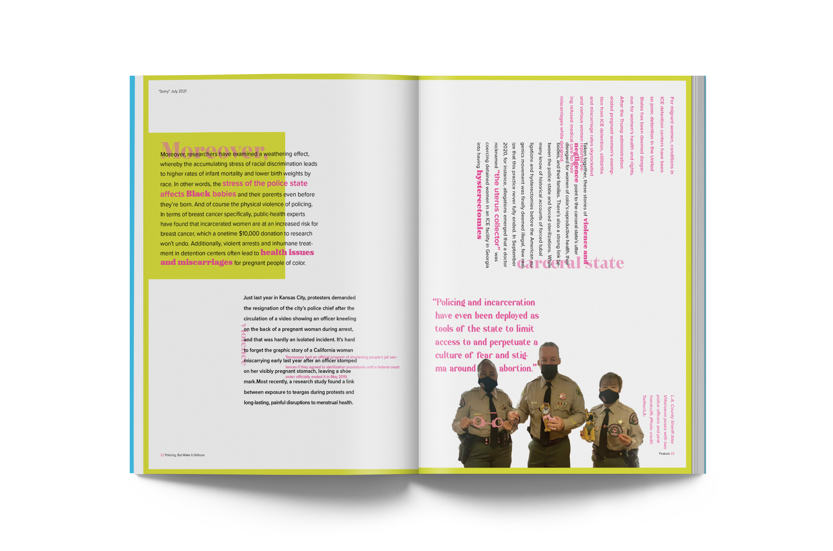
This process began with content gathering to help get a better feel for our publication. The two articles I designed include an interview with Ziwe, a rising black comedian that asks the hard questions about race, and an article on the pinkwashing of policing.
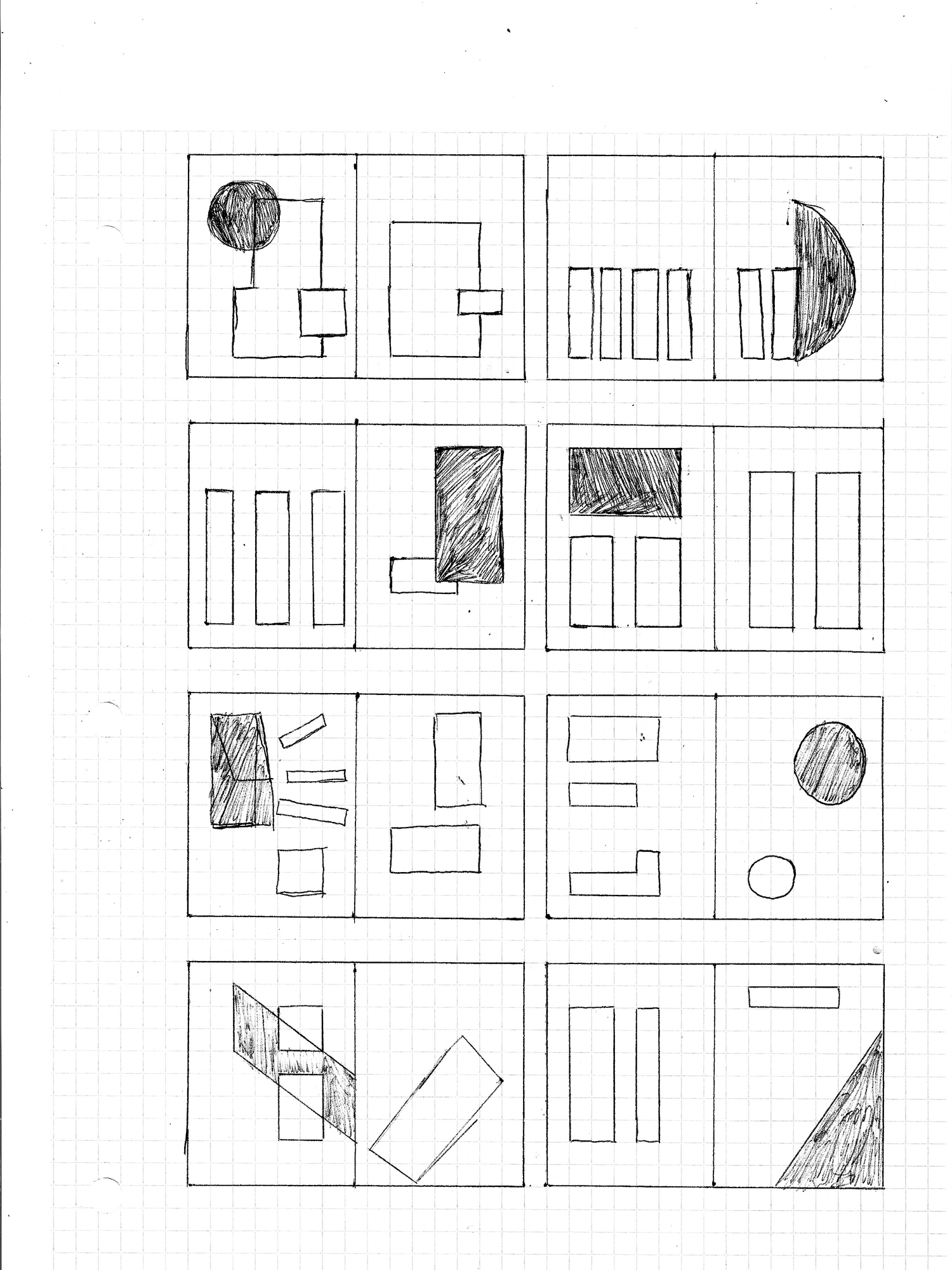
Sketches
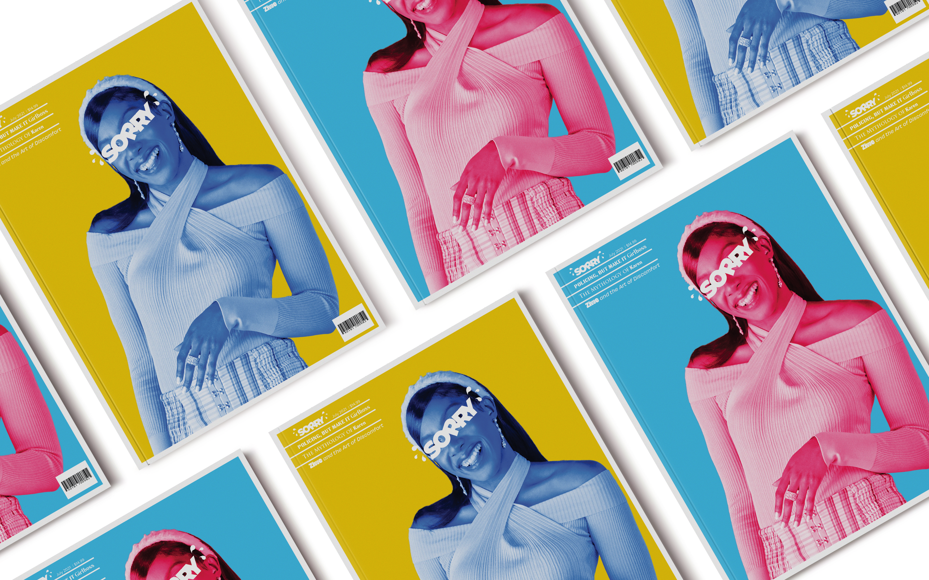
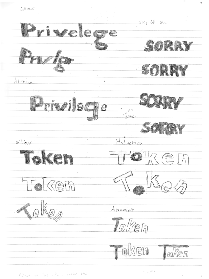
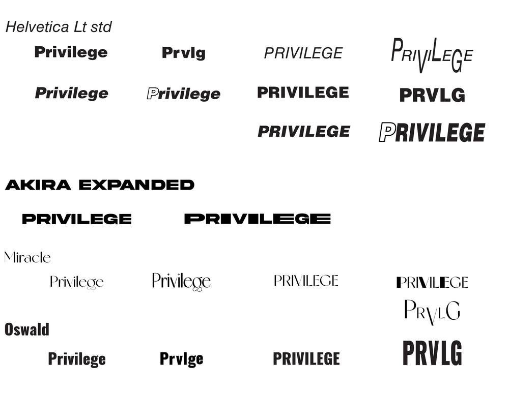
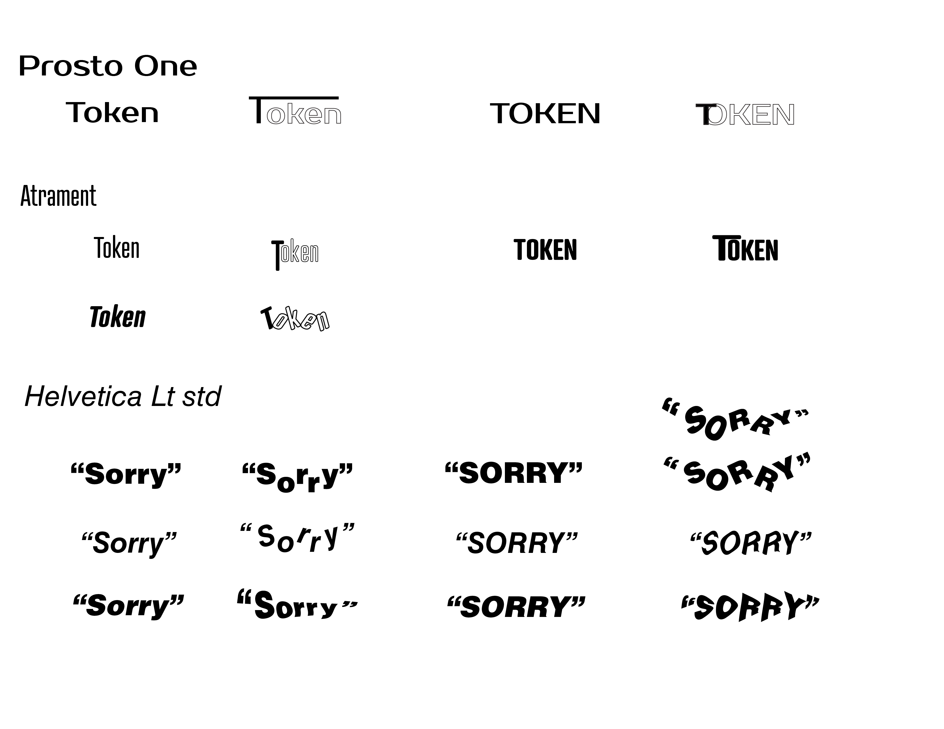
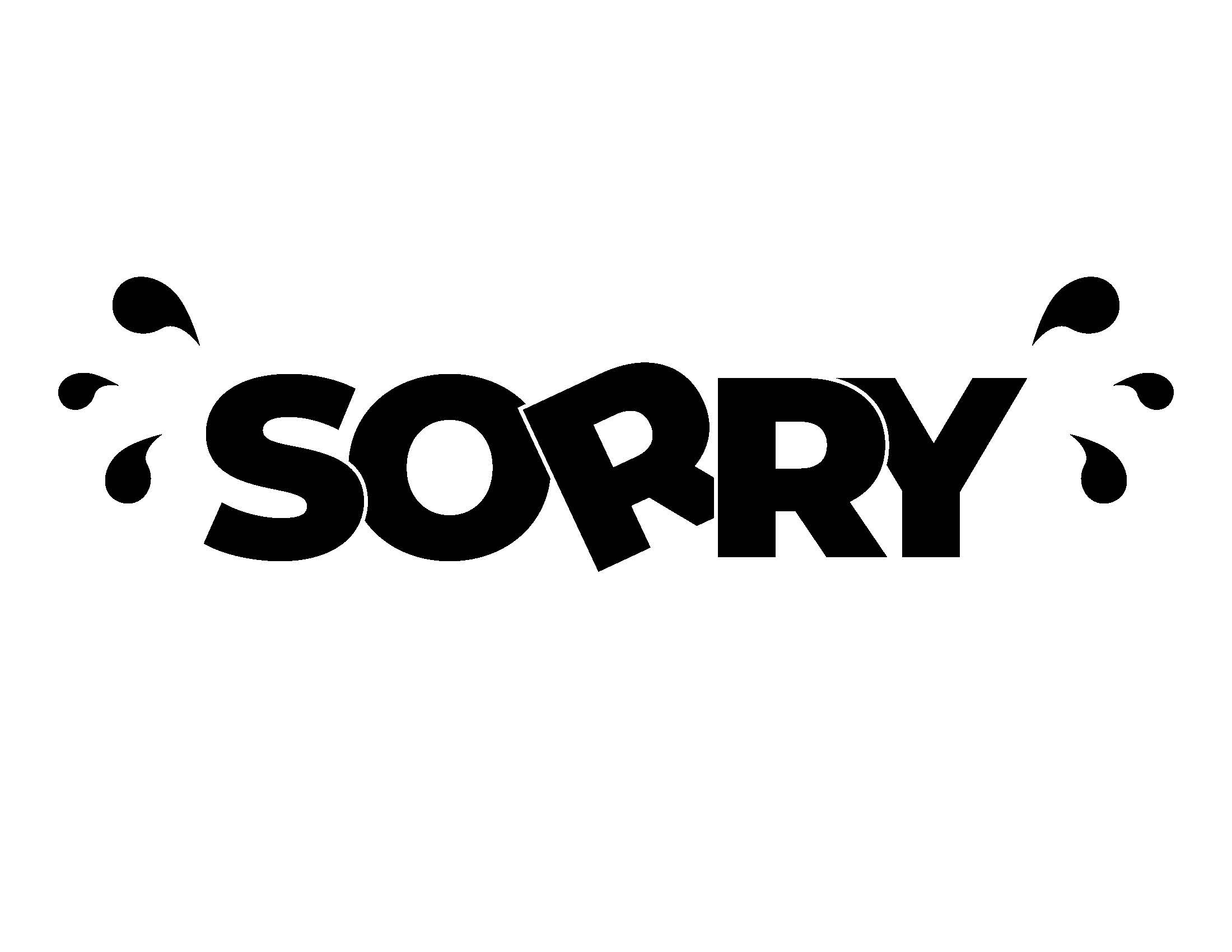
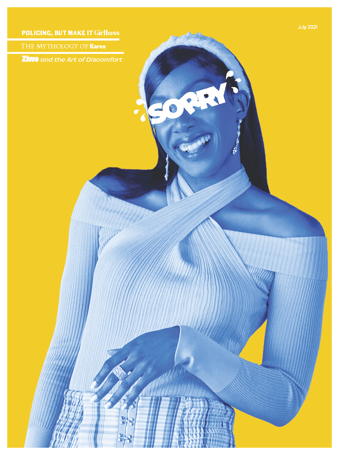
The wordmark had to reflect the tongue-in-cheek nature of the publication while staying accessible so I chose gill sans a sans serif font with a heavy weight as a nod to the humor of the publication. Playing with the implementation of literal tears in the counter space of the o, offsetting the letters from the baseline, and adding quotations to evoke sarcasm.
Strategy
Sorry is heavily inspired by zines and Emigre magazine that changed up its layout for every issue. Sorry takes a similar approach, changing type size and layout to give each issue the feel of an art piece more than a traditional publication. I also use a wide array of fonts depending on the theme of each article using regular Proxima Nova on the body copy to link them.
Final Layout
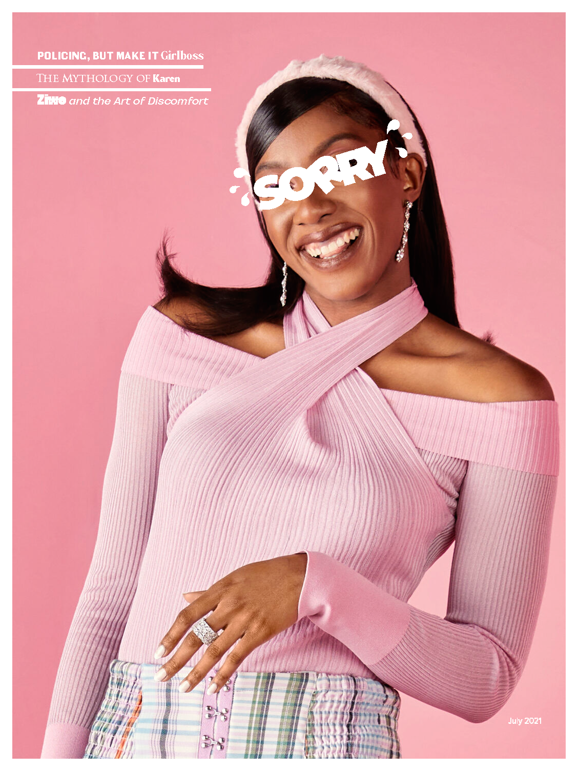
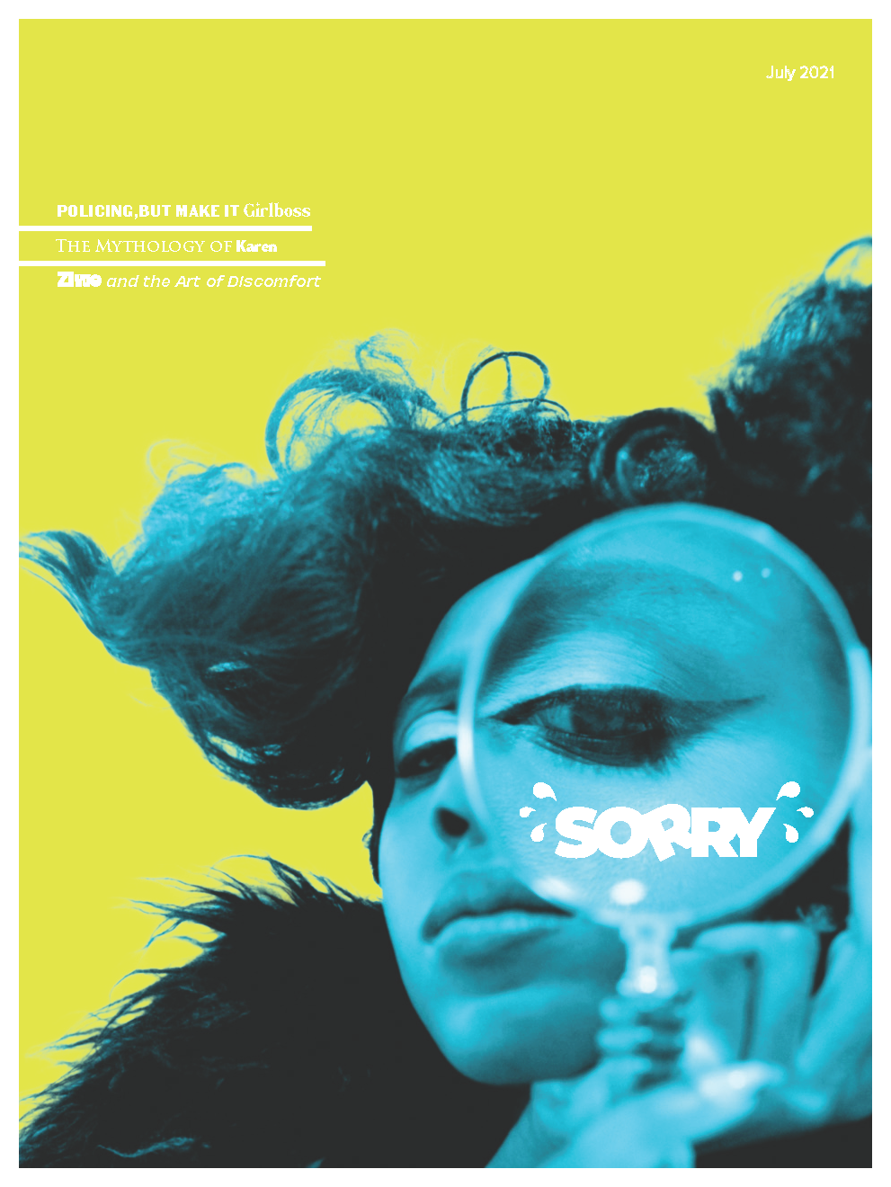
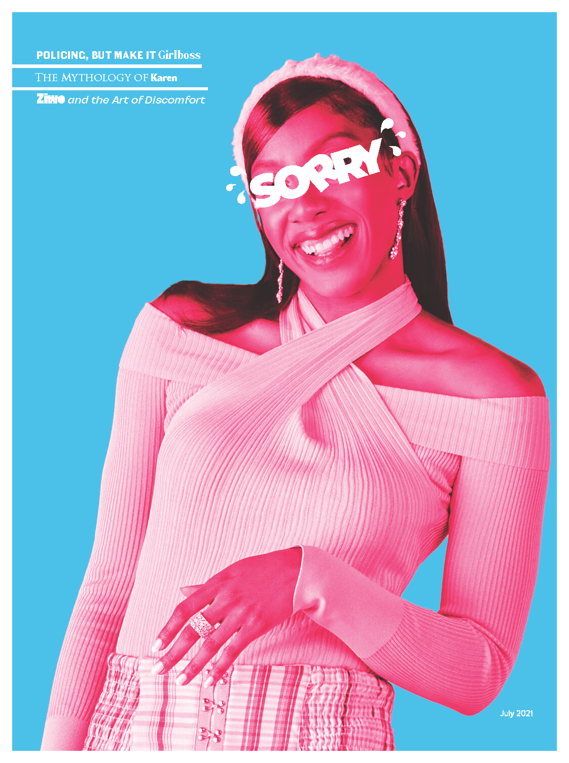
For the cover, I stuck to high-contrast colors and placed the wordmark over Ziwe’s face as it would be simple enough for future issues to replicate while still maintaining the humor. The resulting publication is a visually rich art piece that viewers can interact with while still taking away important lessons on social issues.