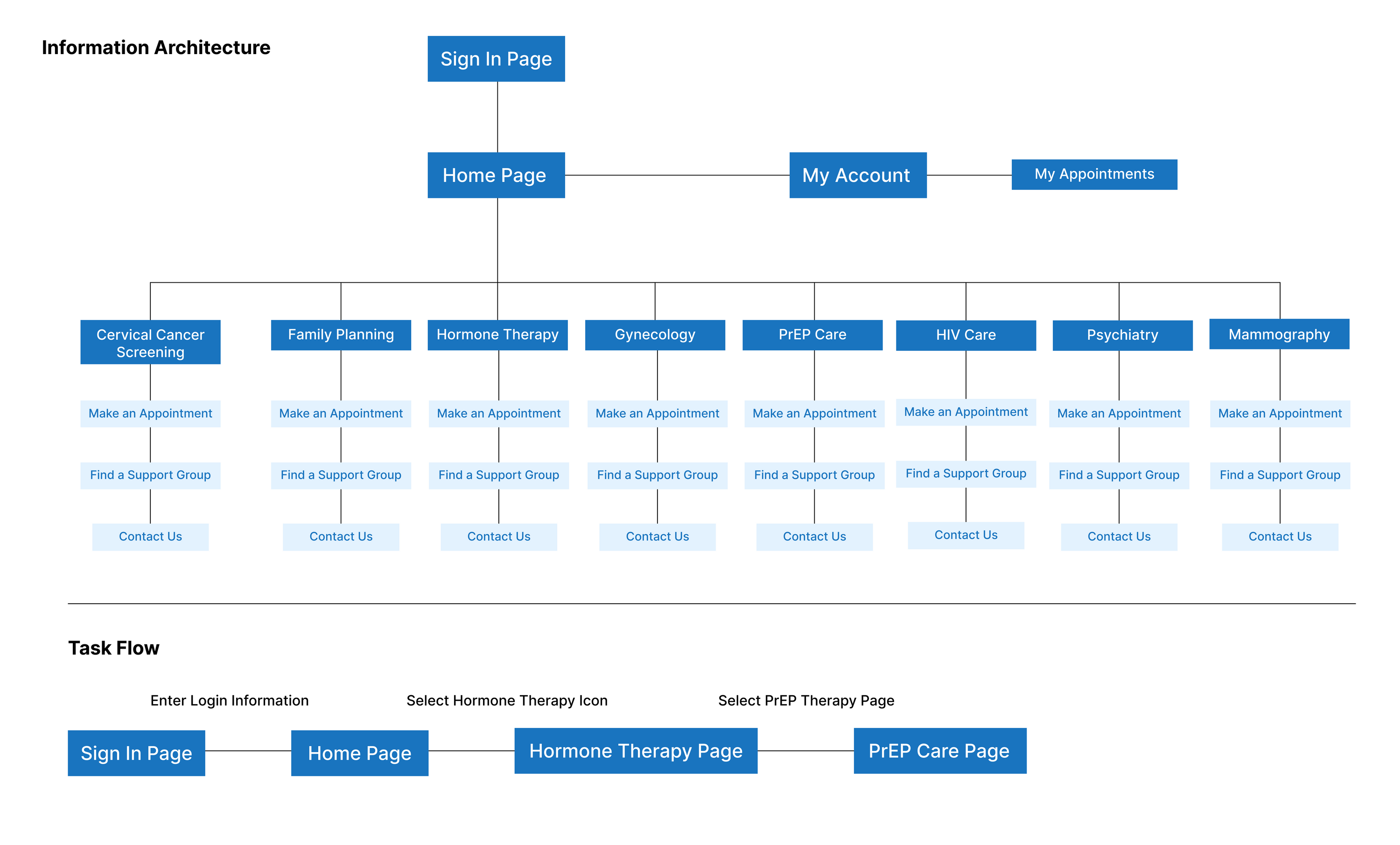
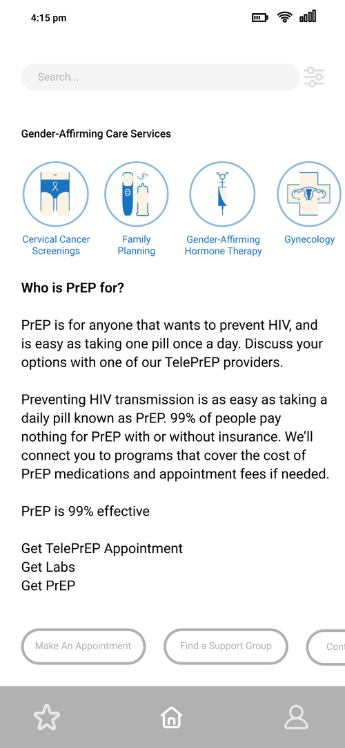
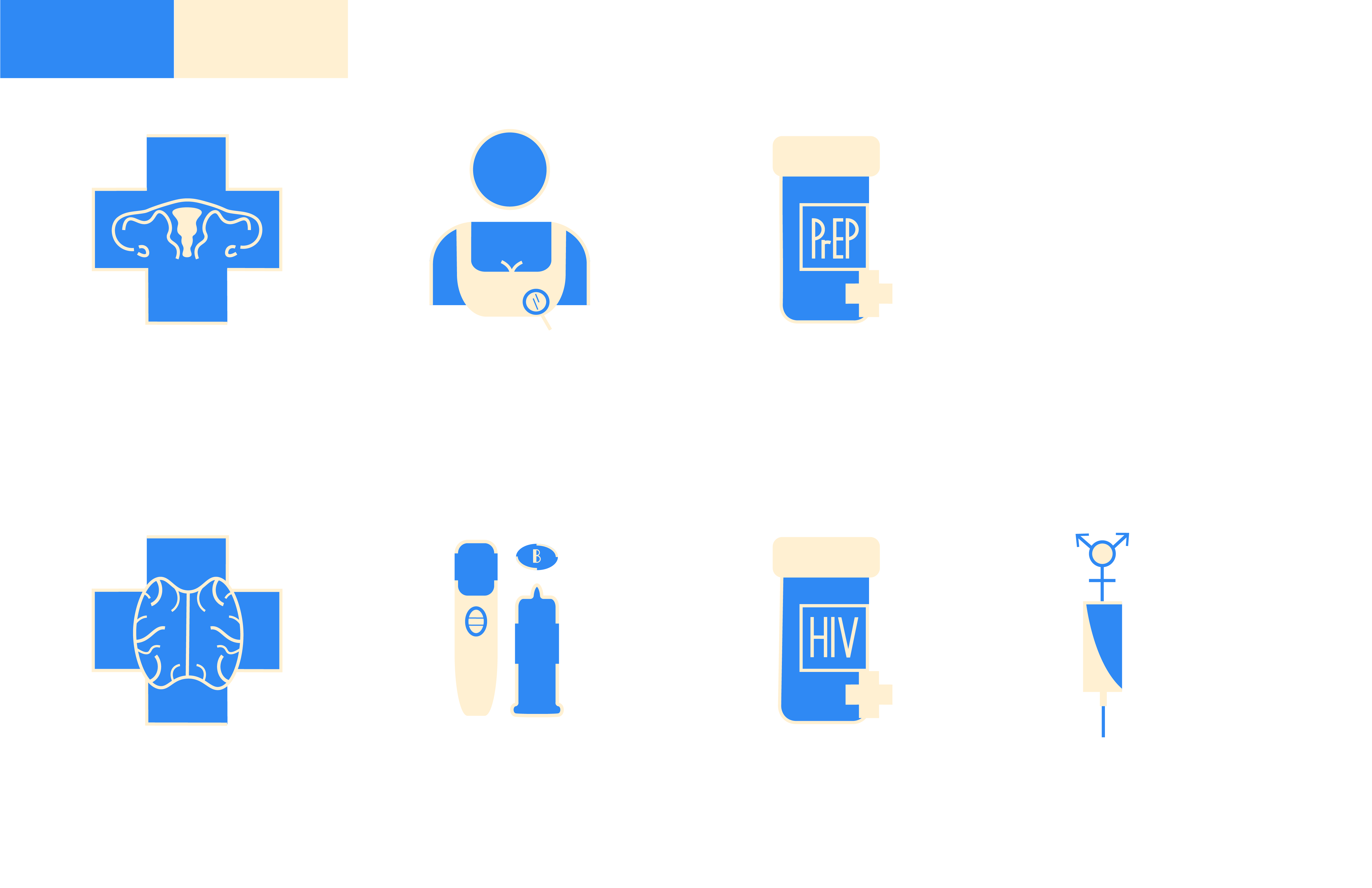
Equitas Health Icons
Objective
To develope a system of symbols that appear visually and conceptually cohesive as a family of forms. To create inclusive icons.Sketches
Client
Equitas HealthDeliverables
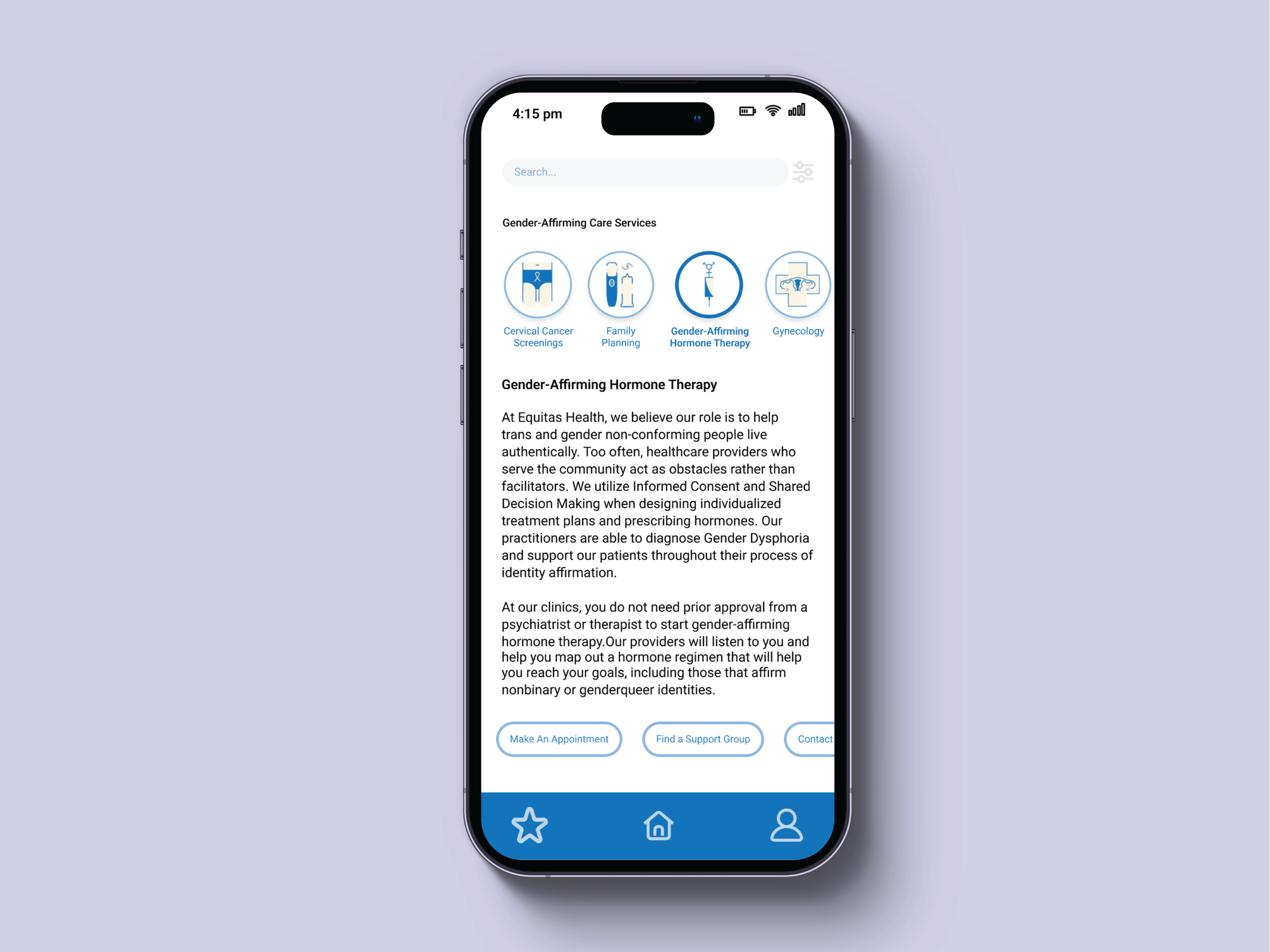
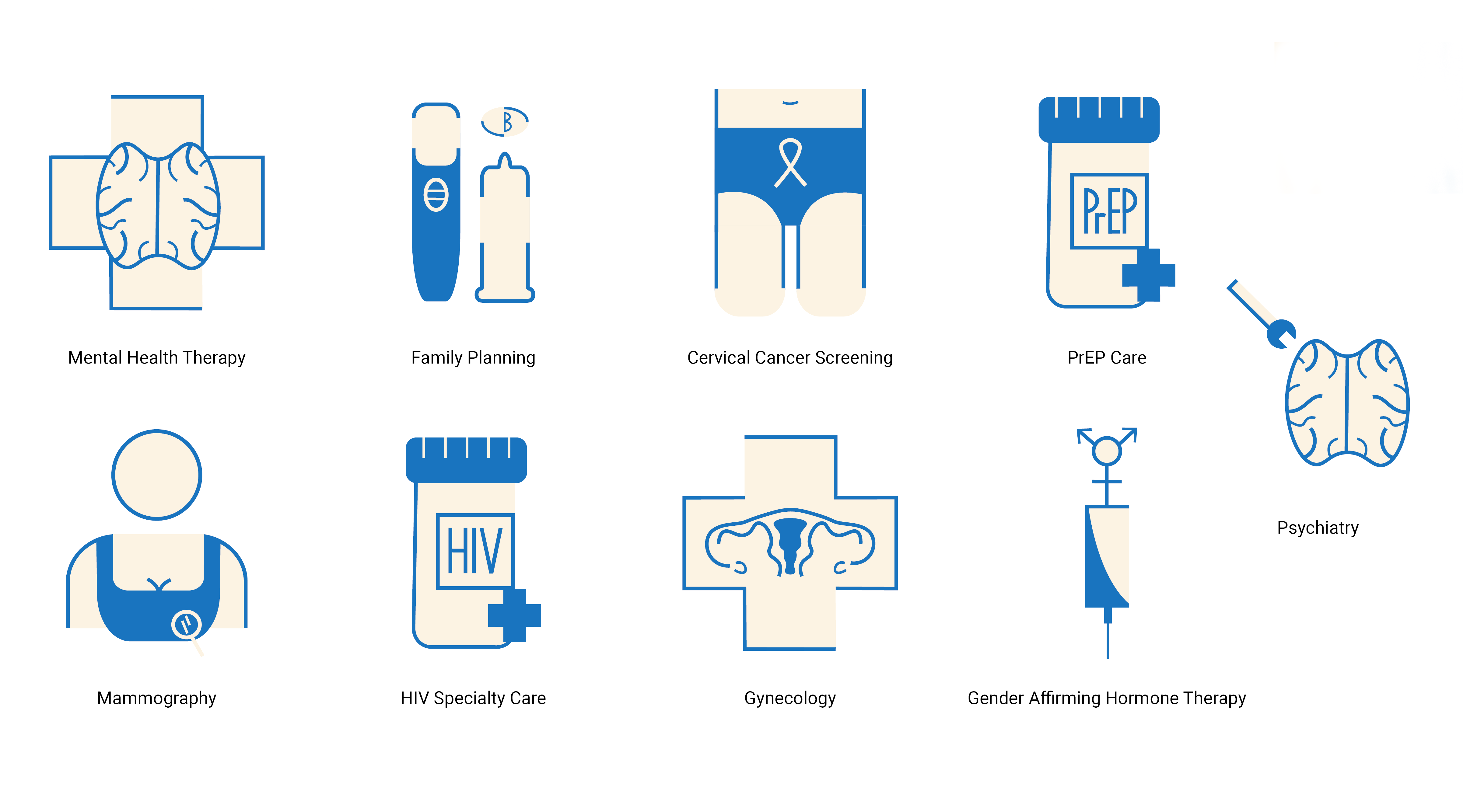
A set of icons to represent the different servicesin the gender-affirming care program.


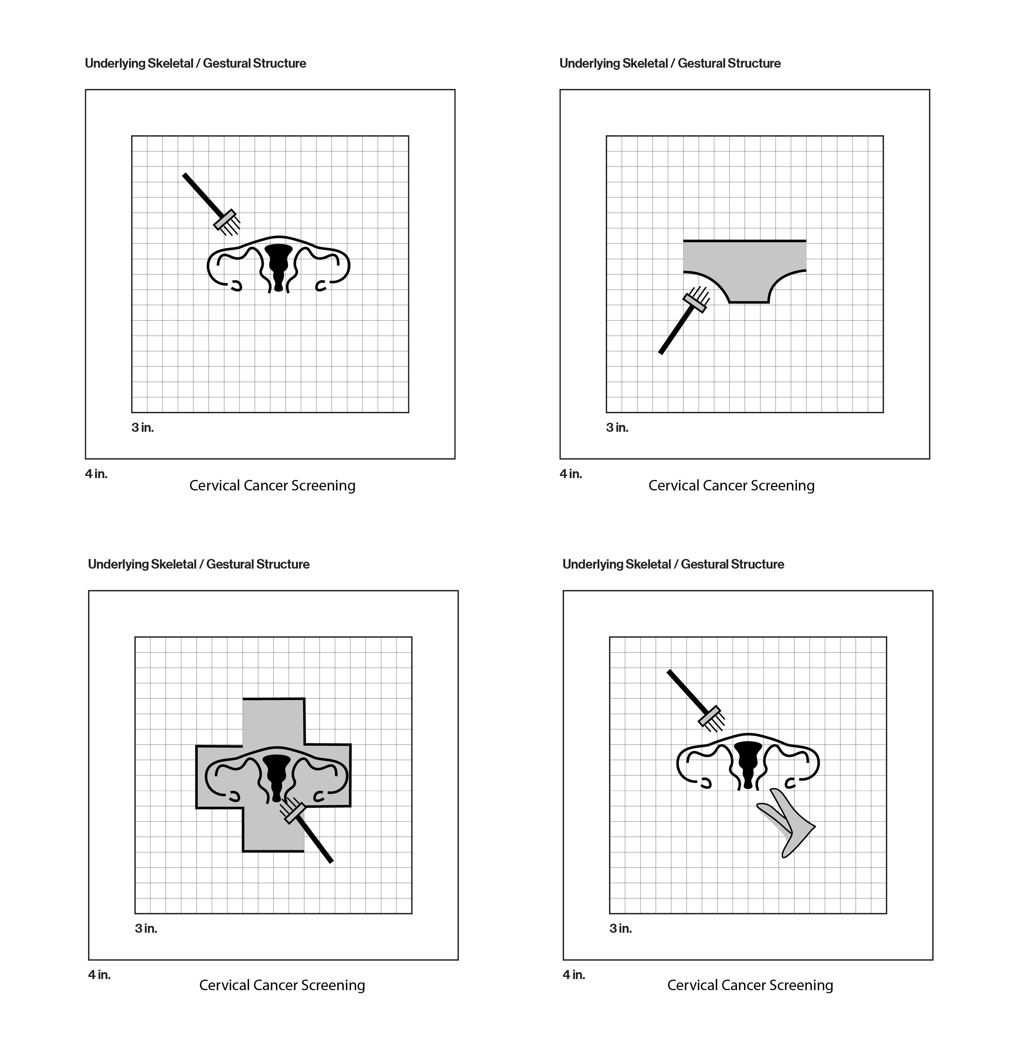
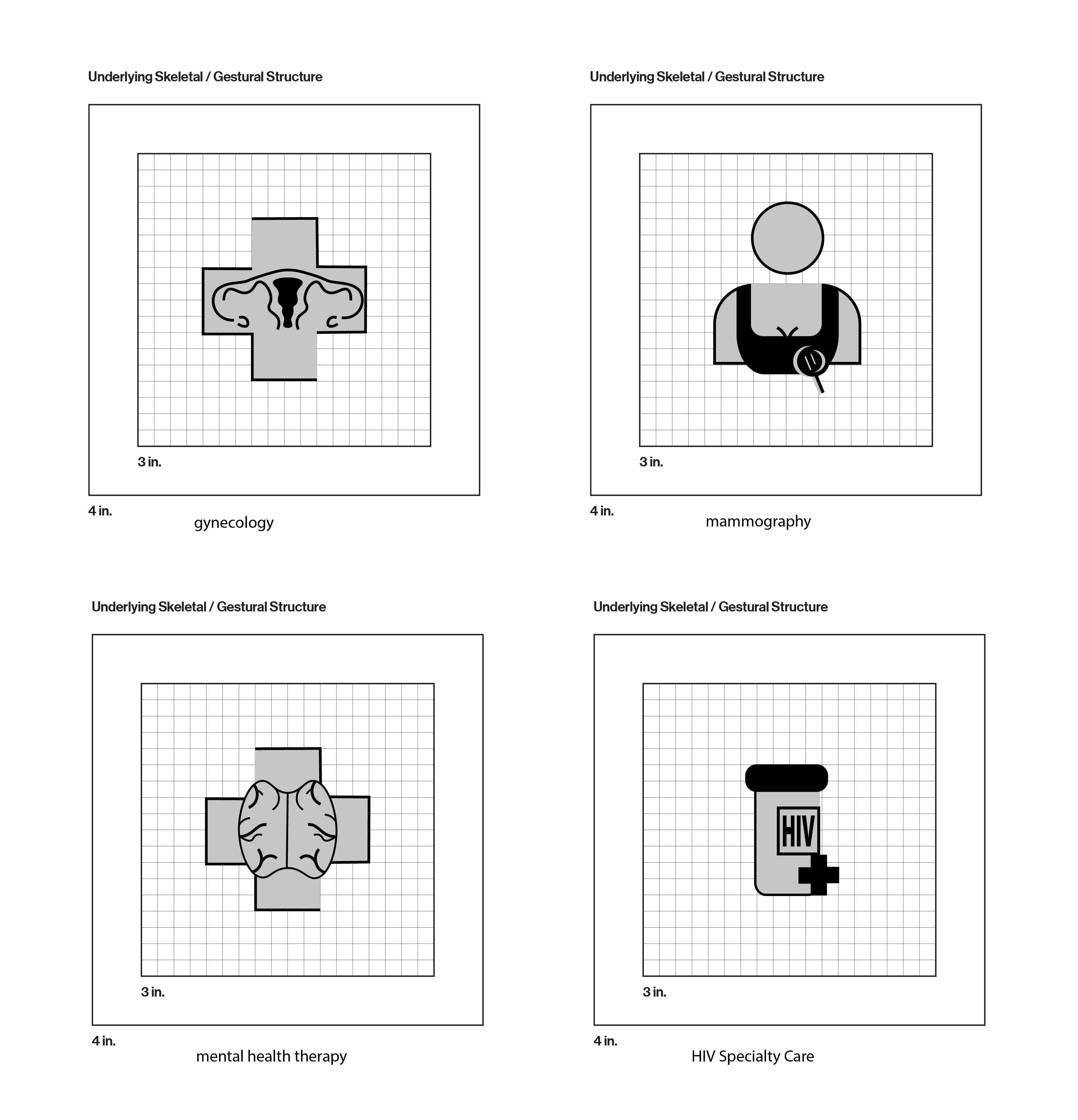
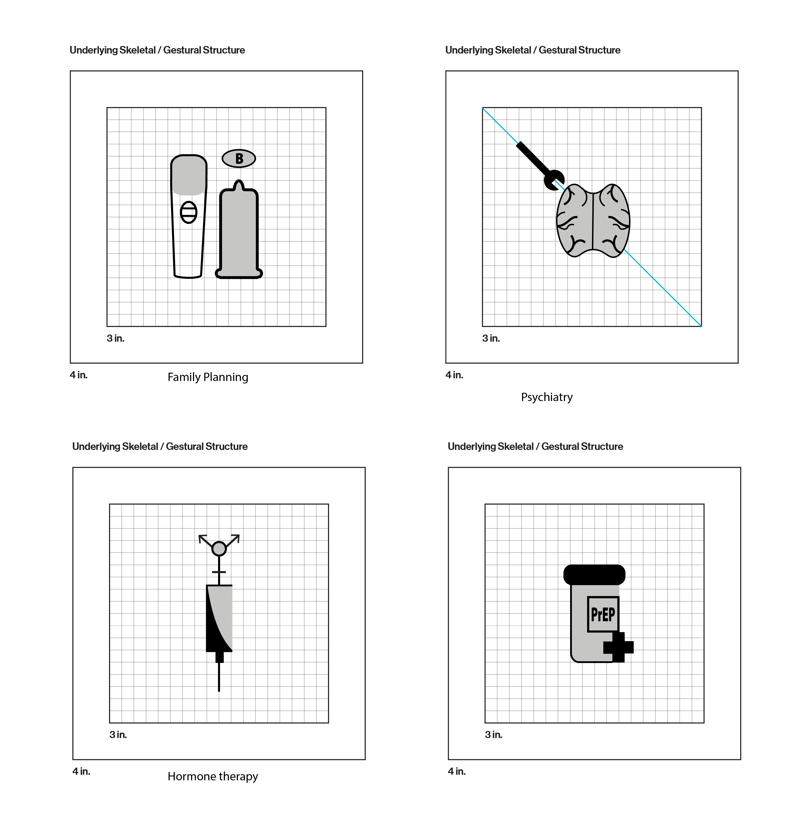
Iterations


Research
I began with a secondary research phase to learn more about the details of each service. The gender-affirming care aspect meant that the icons had to appear gender-neutral to be inclusive to the transgender community.Strategy
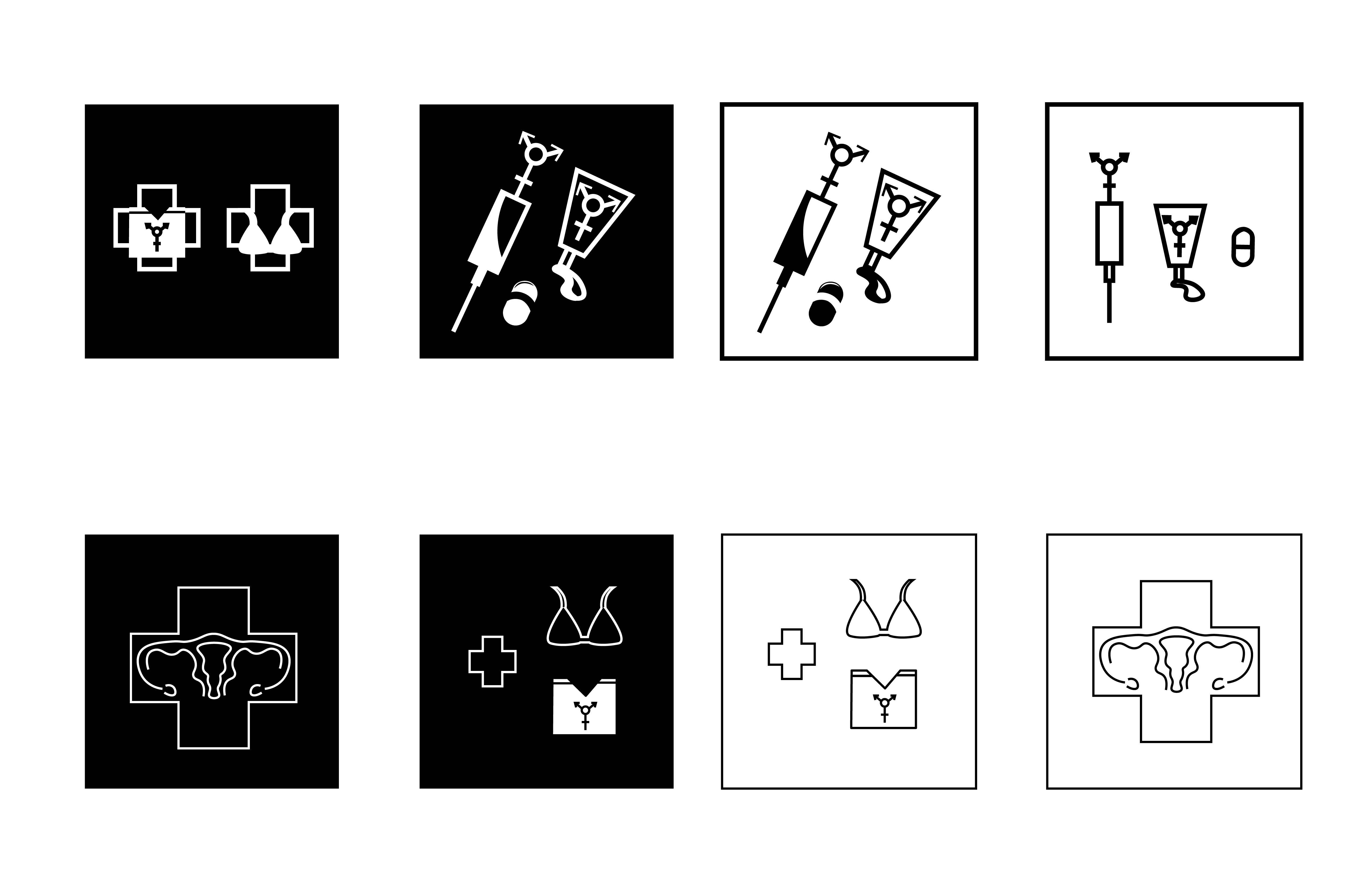
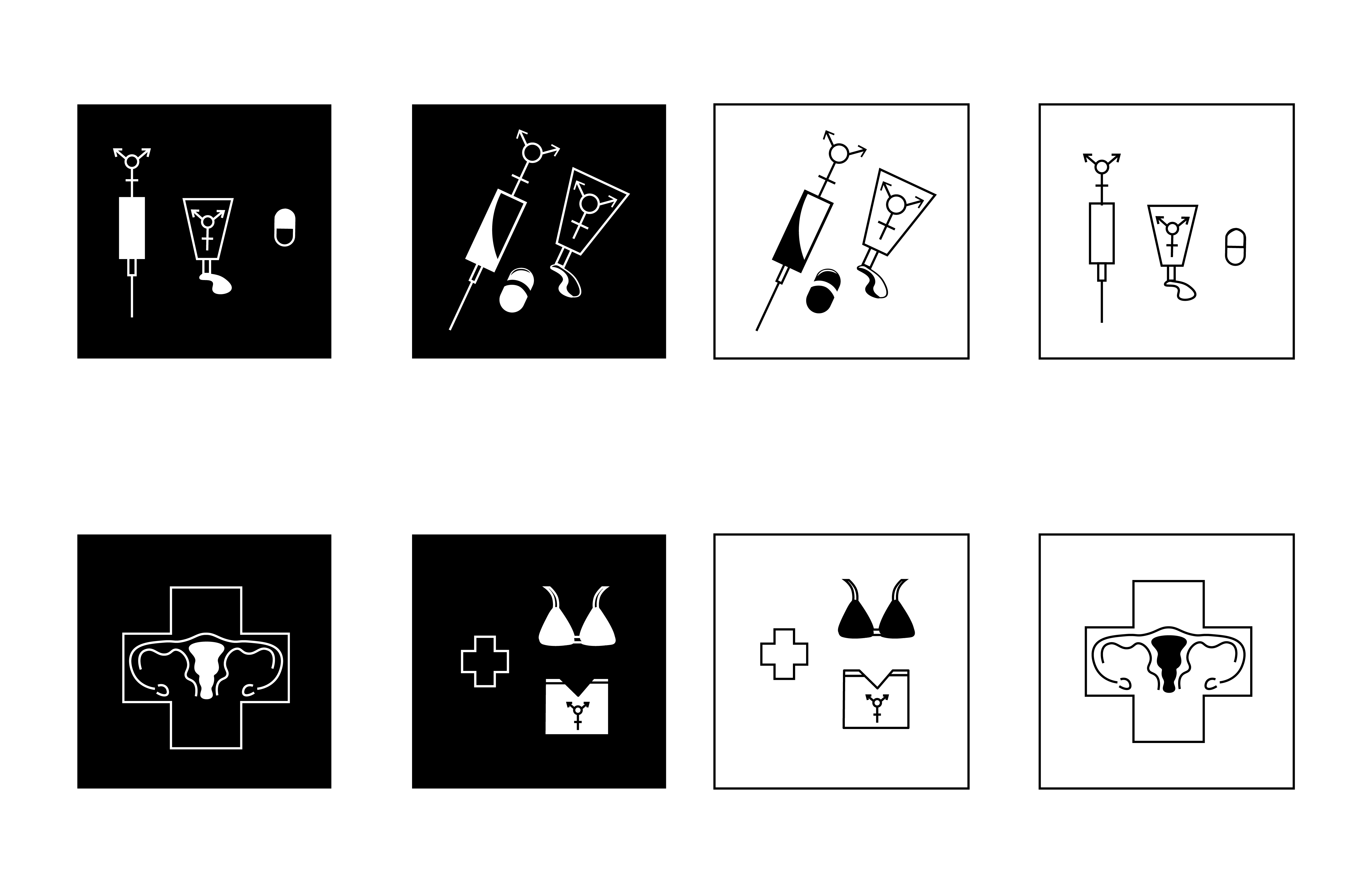
For the hormone therapy icon, I used different representations of estrogen and testosterone whether that be chemical symbols pills or needles. With mammography, I tried different representations of the machine or overlaying a bra or chest binder over the health symbols.Scale Iterations
Color Iterations

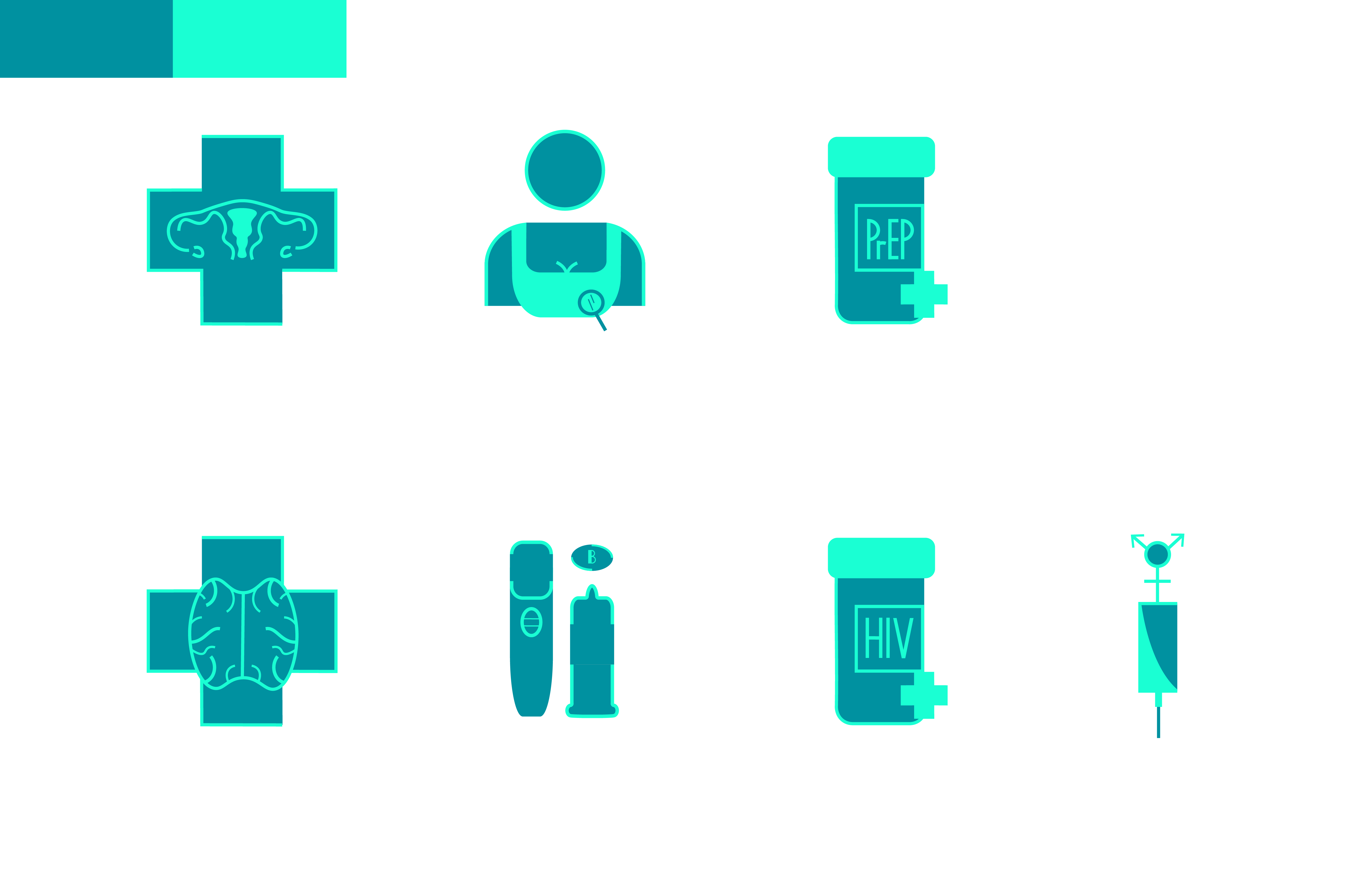

Icon Iterations
I experimented with fill, negative space, and using points, or lines in the symbols. It took me a while to find a good balance in the number and positioning of points to make them less overwhelming. Overall I was drawn to the dimension that adding gray value brought to the set especially in the mammography icon when the gray is against the white.


Final Icons
The icons use a 3 pt line weight with 2 pt for small details like the magnifying glass. For the Prep Care and HIV Care symbols, I created my own font with similar widths. This project taught me how to visually simplify complex concepts and represent health issues more equitably.